|
since...(sorry for repost this in THIS forum)
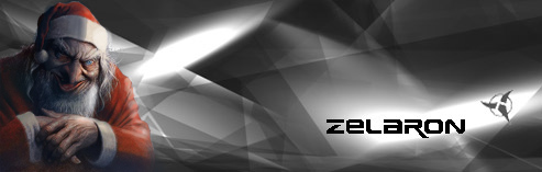
Since I am going to redecorate PS2, I first changed my signature, what do you people think?
|
It'd be nice if the font was readable
|
screw those small fonts, haha...they ain't that important...I meant, OVERALL???
|
I can read it but it could be a bit clearer.
|
I said.....SCREW THE FREAKING SMALL FONTS!!! Overall what do you think? ( despite the small fonts ) geeg
|
The text needs some work..
|
k...I give up...enough about the text, haha. I WILL try to work on my text though!
|
Quote:
|
yeah, that was what i thought...but if it gets too big, it will block the face though...TOUGH DESICION
|
Maybe if you made it a bit darker?
|
Or the text larger?
|
Quote:
|
well...don't worry about it, I will fix it as soon as possible, thanx for the advise though~
EDIT: I just want to know, are you guys talking about the UPPER SMALL text, or the 'omega sin' itself? |
Both.
|
The text is barely readable. It looks like you filter-whored everything. The background isn't very appealing either.
The main reason no one likes it is because the text kills it (both small non-antialiased text and "mega sin" text). |
Calm down on the ripple filter.
|
haha, I ALWAYS struggle with the text, it really kills :(
|
hmmm... What about the text? Its not readable :(
|
^^ im not much a ps2 person but, i cant even tell what your image has in it... i see half a guys face and the rest is a blur
but i guess im not one to talk my images suck |
'sin agemOmega sin'.
I can read! |
| All times are GMT -6. The time now is 06:47 AM. |
Powered by vBulletin® Version 3.8.2
Copyright ©2000 - 2025, Jelsoft Enterprises Ltd.
This site is best seen with your eyes open.