|
New Sig/Avatar (noobed)
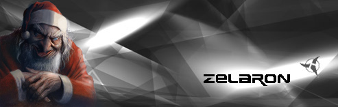
Yea I made them with a cheezeball Graphics program.
|
heh its good, but i think your name needs to be a bit more readable(is that how you spell it?) and maybe you could have it stand out a bit more, but other than that its nice.
|
I made myself a new sig as well, because Grav complained about my old one being too big.
Yours is good, but I would either choose a different font or maybe give it a 1 px black stroke. |
Quote:
|
the avatar rocks. the sig... try losing the extra white broader thingy.
|
i think the sig rocks
|
Thanks man
(my first original sig) |
Make the font more readable. And I beg of you -- try to lighten up on the filters.
|
TeH RoXxEr
|
My suggestion is to take out the swirl on the sig. On the avatar it looks wicked but on the sig it just makes the text even less readable.
|
| All times are GMT -6. The time now is 08:21 PM. |
Powered by vBulletin® Version 3.8.2
Copyright ©2000 - 2025, Jelsoft Enterprises Ltd.
This site is best seen with your eyes open.